Looking back to move forward - stronger
Arjo
CLIENT
Arjo
WE DID
Brand identity // Visual identity // Logotype // Tone of voice // Brand guidelines // Communication guidelines // Brand implementation
Arjo, founded in 1957, is a global supplier of medical devices operating in more than 60 countries. In the mid-nineties the successful company was acquired by Getinge. About twenty years later Getinge was divided into two operations and Arjo, once more, was on its own – now in much need of a brand revitalization. They asked Paradigm to help out.
The challenge
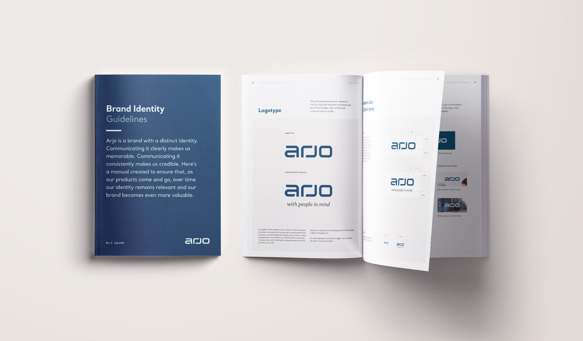
Arjo needed a clear, audience-focused identity that reflected its brand promise “With people in mind.” The goal was to shape the perception of the company and the people behind it – and get everybody on board. The project’s scope included designing a new logotype, creating a tone of voice, and tools for supporting the implementation of the new identity.
The approach
The first step was to get to know the client, the competition and the market even better. After laying a solid foundation, Paradigm began developing the different elements that together would create a compelling brand experience, engaging both customers and employees.
The solution
A new logotype was designed, using the original Arjo logotype as inspiration. The new colors in the palette were carefully selected to convey trust, warmth and professionalism. Arjo now has an authentic and attractive identity to reflect the modern and people-focused company that they are. After a global awareness campaign, the revitalized brand has been embraced internally and successfully rolled out to all market.
Want to hear more about this project,
get in touch!
Client Director
Annica Smith
Phone:
+46 708 23 85 77
Email:
annica.smith@pdgm.se


